

An eBook for Geotab flipped into multiple languages. AODA compliant. Some interactivity is built-in.

A recent security brief generated for Magnet Forensics incorporating the company’s new branding.
A recent Whitepaper for Geotab flipped into multiple languages. AODA compliant. Some interactivity is built-in.
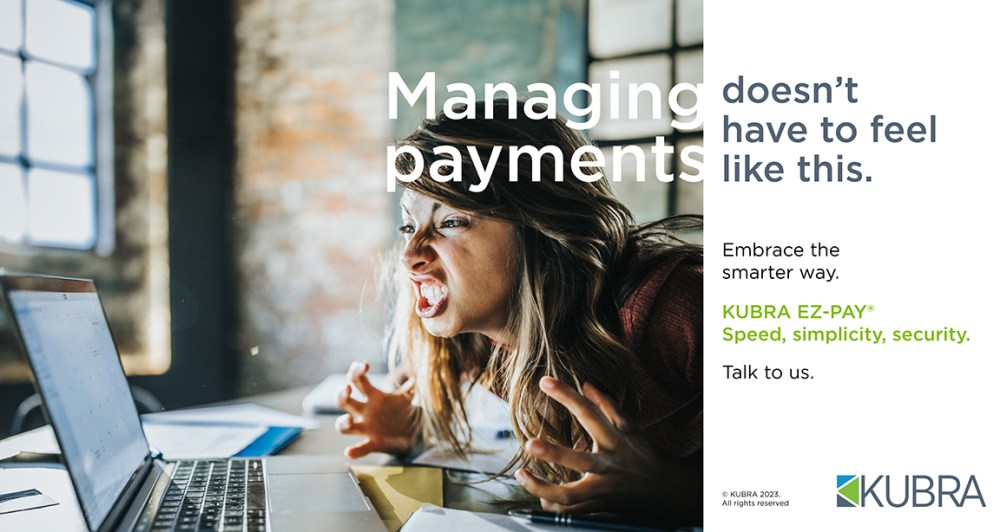
An advertisement generated for KUBRA fall 2023.

A recent Whitepaper for Geotab flipped into multiple languages. AODA compliant. Some interactivity is built-in.

This booklet was a marketing piece for CultureWorks, aimed at developing relationships with Universities and Colleges across Canada. Testimonials, statistics, and potential growth opportunities filled the book. I handled the majority of photography on the interiors as well.
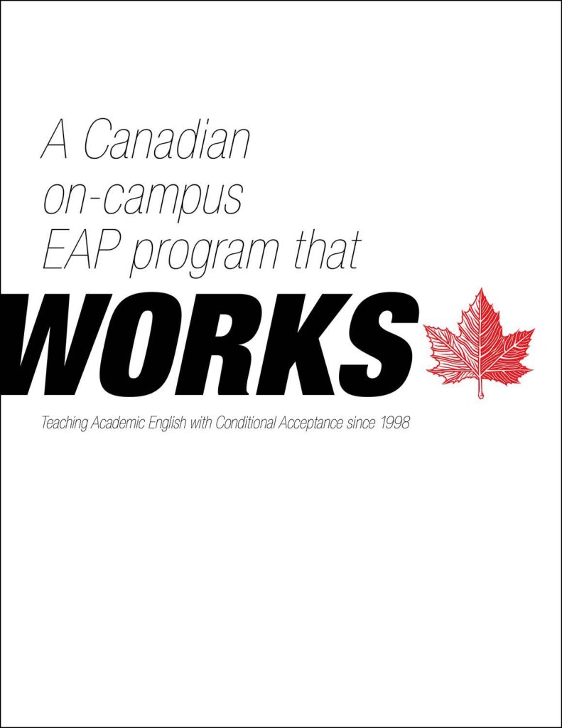
An overview of the offerings at CultureWorks, detailing some of the partnerships the school developed with Universities and Colleges across Canada. Some testimonials and statistics were added in for esthetic. I handled the student photography on the interiors as well.

A custom die-cut 3/8 inch spined receptacle mailed out to students upon admission to Brescia. This was built as a one-off design and was repurposed over multiple years after the initial version. Brescia provided copy and visuals, and I did the rest.
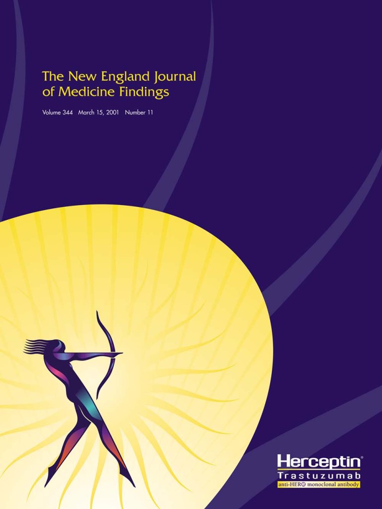
Unlike most sectors, pharmaceutical has some very unique creative challenges. One of the biggest challenges is making the imagery they already have look good. I’d taken this particular look and created numerous pieces of collateral that support their brand image in striking ways. One specific item I’d designed for Herceptin has a pen on a lanyard attached to the side of the printed piece with a clever die-cut on the spine.
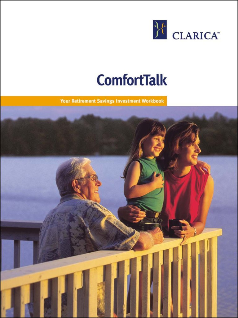
My first job at Quarry was to “de-mutualize” the Mutual Group. The client needed a ton of materials done for the Clarica launch. Everything from large corporate brochures down to personal name tags. I had to sign a confidentiality contract and then worked on all of their new Clarica internal collateral long before the Mutual employees knew their company’s new name. It was an enormous undertaking – and one of the most significant re-branding projects I have ever worked on.

Hope’s Garden needed to be identified as a safe place for a young female audience to access resources for eating disorders. Because Hope’s Garden is not a medical facility, they needed to engender confidence while portraying their services accurately. Hope’s Garden’s goal was to help their audience realize they might have a problem and to have that audience contact the centre for more information. With this creative, Hope’s Garden appreciated increased media exposure. The arresting visual yielded more phone calls.

BASF wanted to stress Pursuit’s strength in growing no-till soybeans for this campaign. The logical way to tie Pursuit (a relatively strong branding utilizing a fighter jet analogy) with the No-Till feature was to render No-Till to look like the Pursuit logo. This was my first idea in a long string of pencil sketch ideas and ultimately wound up being the creative the client bought.

I have done much work with Research In Motion (RIM). RIM tends to have brand standards and preset guidelines dictating the type of design you can do for them. This Customer Profile Reference Book helped personify the kind of clients some of their salespeople might encounter who are looking for a smartphone solution. This guide was a successful tool used internally to promote an increase in sales and strengthen BlackBerry brand awareness internally.

I created a music website in October 2006 after being turned down by every local London vehicle to review and photograph live concerts. Initially, the magazine was delivered in a downloadable PDF format, allowing me to photograph, write, edit and design it like a functioning magazine. A lack of downloads steered me to post articles using WordPress to increase traffic. By 2009, Fazer had 16 contributors.

This viewbook showcases the Waterloo Faculty of Arts by profiling success stories within the university through stories and photography. The viewbook features a unique cover by course graduate Vincent Marcone. I worked with a Waterloo photographer, art-directing the photography within, and designed the complete booklet. This viewbook was then mailed out to stakeholders.

I was involved in a pitch for a book of business from Baxter’s pharma division. They have a drug called Suprane, an anesthetic delivered to patients via a tracheal tube. This drug allows the patient to emerge from an operation quickly, with a clearer head than competitors’ drugs. I generated six ideas targeted at Suprane’s rapid emergence benefits. This was one of the proposed artboards.
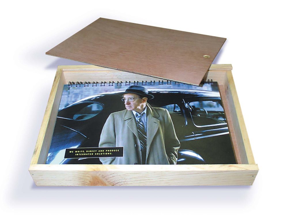
While at Quarry, we learned that Bayer would launch a drug competing against Viagra. We wanted to send something to the Bayer marketing department that would keep us top of mind for future work. I built a single wooden box and filled it with images of ‘woodies,’ from Woody Allen, Woody Harrelson, Woody from Toy Story, to Woody Woodpecker. I wanted a line that said Quarry knows Woody’s at the end of the piece – hoping the client would get a laugh out of the creative and call us to launch the drug for them in the coming months. The box took three working days to make, from beginning to end. It was time well spent – the client LOVED the finished item.

A writer friend I used to work with is now living in Chicago. We occasionally do spec advertising together. He’ll write a concept, and I’ll make it look pretty. We have three ideas for Fender guitars that we both like. This is one of them.

Using the theme of finding your true nature in Earth Shoes, my friend and I generated a campaign of five inserts for the inside of Earth’s shoe boxes. The idea is that you see a visual and get an initial impression of a mood. The copy then tells an entirely different story to the audience. For the client – it’s the story of finding your true nature in Earth Shoes.
